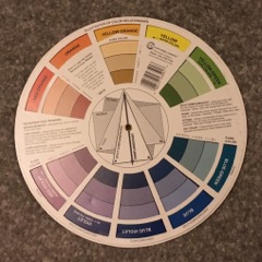
Skin is made up of a range of colours giving an overall visual of different tones of browns and creams. When mixing colours there are only 3 primary colours that make up the full range of colour that we see. Red, Blue and Yellow. The skin spectrum range is cool to neutral to warm. Skin with a cool undertone will have more blue colour, and a warm undertone will have more red.
When mixing pigment we not only have to mix to match the skin tone, but also allow for the undertone within the skin that will alter the pigment colour once its been implanted into the dermal layer of skin and the area has healed.
Another consideration is how each of us view colour. We will all perceive colour slightly differently and sometimes view ourselves darker or lighter in skin tone than other people do.
A consultation involves the practitioner as well as the patient (and patients friend, partner, mother etc) to determine the best choice of colour. Don’t be told which colour suits you best, be advised, but be allowed to have a say, as you will be the one wearing the pigment on your face or body.
Sometimes more than one colour analysis test is necessary to determine the correct colour choice. Medical Tattooing is not a one stop shop, it takes time to find the correct colour, time to heal, and time to apply in a safe and prudent way.
The Colour Wheel was designed by philosophers and mathematicians, is it ever used by artists?

I have never used a Colour wheel even though I have owned many and love its design and mathematical certainty. However when I’m looking at colour I can only use my intuition and my sight to guide me. If I look at a colour wheel I can get lost in trying to work it out rather than an instinctive and educational knowing. Had I known its heritage comes from mathematics and philosophy I may have studied it more, purely on an intellectual level. It is a beautiful object and even more beautiful now I know its ancestry; that many important and intellectual people bothered to put on paper how we perceive colour. Even in its legacy it was perceived differently. Newton spoke of 7 colours that relate to musical notes, whilst Goethe and then Schopenhauer created Colour Wheels from 6 major colours, not linking them to musical notes at all.
When the eye sees a colour it is immediately excited and it is its nature, spontaneously and of necessity, at once to produce another, which with the original colour, comprehends the whole chromatic scale.
Have any artists actually ever used Colour wheels? Why were they not designed by artists? Potentially because an artist doesn’t need one. Why take the time to create a colour wheel when you know what works. Would we have bothered to create the wheel if we already had movement and easy transportation?
I remember being in New Mexico and thinking about colour. How colours were complimented by each other. I though the best way to find this out would be to look for the answer within nature. My 2 main complimentary colours that came out of this exercise were maroon and gold, and green and brown. Green and brown are not a huge find, I mean we see it all around us in England, where we are born in a plethora of grass, trees, woodlands, forests, gardens. But maroon and gold stood out for me within the desolate barren landscape of the desert where you may only see one magnificent flower over a period of miles. Luscious blood coloured flowers surrounding the golden stamen.

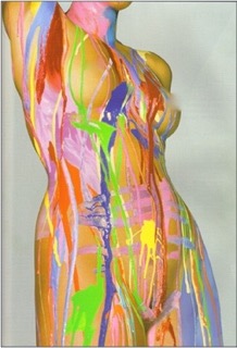
Photograph by Donna Trope. Body painting by Rae Denman
Medical tattooing is the art of colour, design, understanding expectations, and technique. Staying up to date with all these areas is essential to great results.

Recent Comments